
Hero Arts August Kit Blog Hop
Good morning my sparkly Pretty Pink Posh friends!
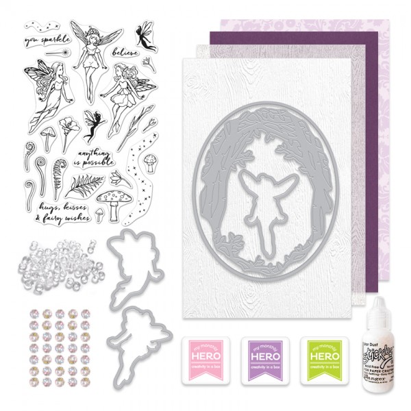
Heather here to share a couple cards using the brand new Hero Arts August My Monthly Hero Box – featuring some Pretty Pink Posh 4mm Droplets – such a fun addition to this kit! We are really excited to be part of their kit this month and also part of their blog hop.
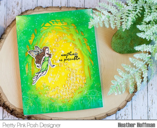
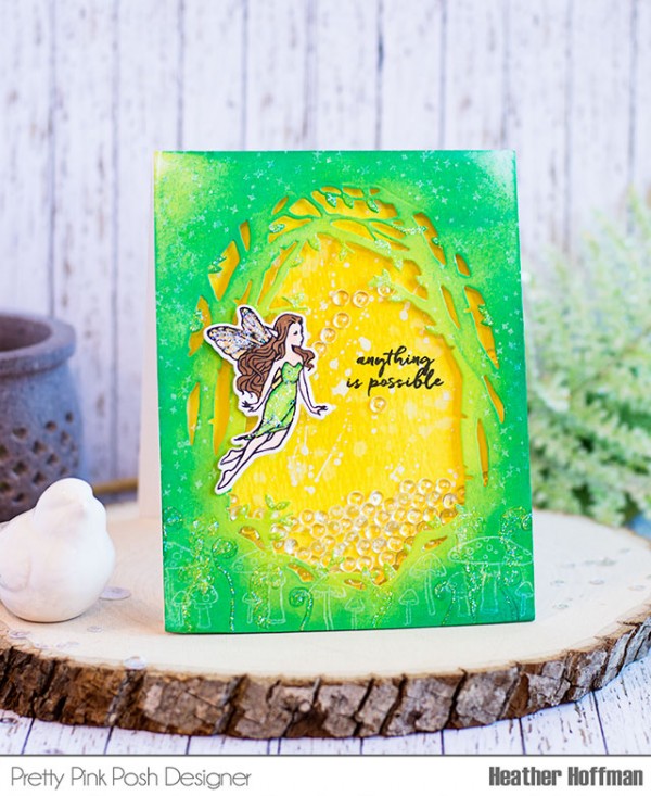
This is such a unique kit – I felt like it was very fresh and different than anything else I’ve been seeing around lately – I started off by putting together a shaker card filled with those Clear Droplets.
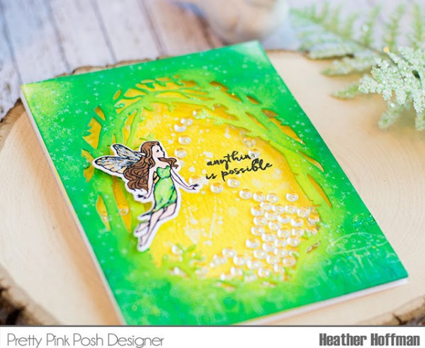
I die cut the Fancy Frame Die Set without the matching oval die, then blending on distress ink in two shades of green. I also stamped several of the little mushrooms and fern pieces in white pigment ink and the same two distress ink colors on the bottom, and added the sparkle star stamped several times in white around the rest of the outside.
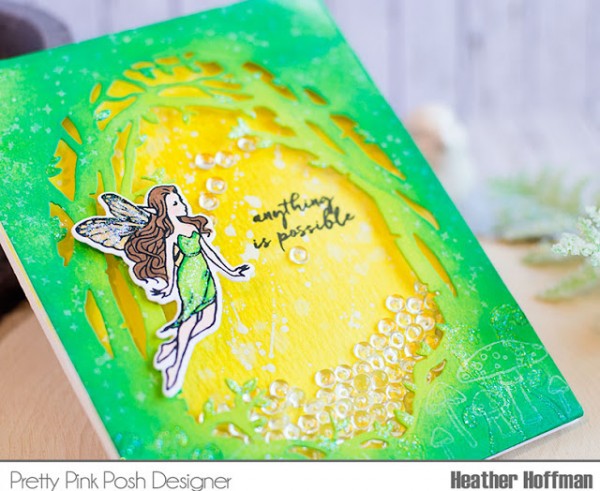
The inside of the shaker card is two shades of yellow distress ink on watercolor paper, some water flicked on, and some white paint splattered over that.
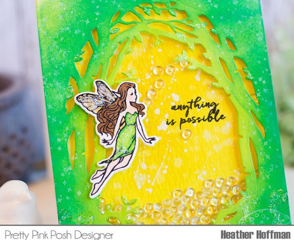
I stamped and colored the fairy, die cut with the coordinating dies, and then added the included Clear Stickles on the wings, dress, and on selected areas around the frame – the leaves, and some of the stamped images on the bottom, then filled my shaker with lots of the clear droplets!
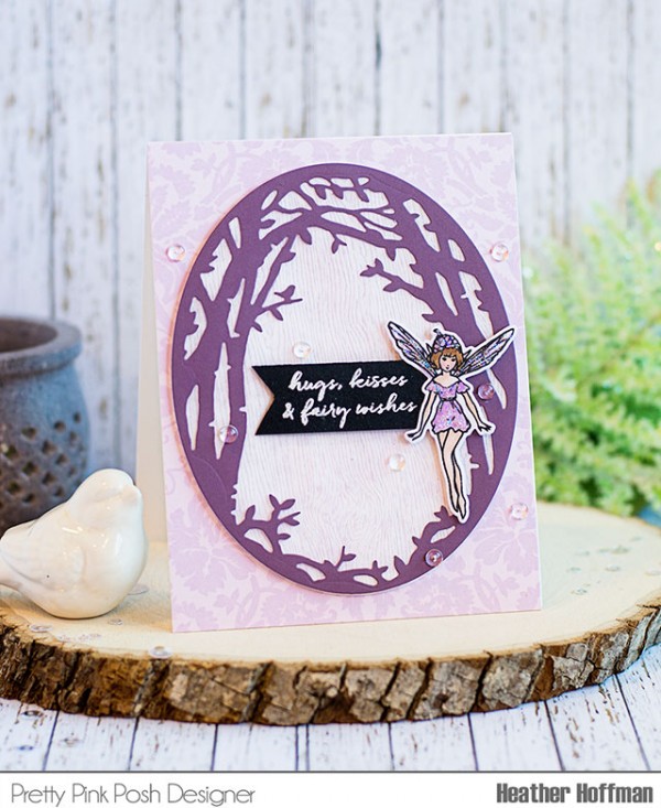
Next up I made a more flat one layer card using some of the papers that came in the kit, and using the clear droplets as embellishments on the front of the card.
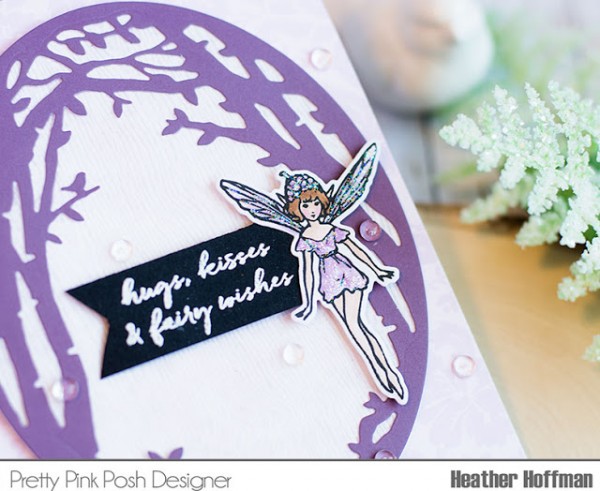
This fairy was colored to match the purple papers in the pack, and also sparkled up the dress and wings.
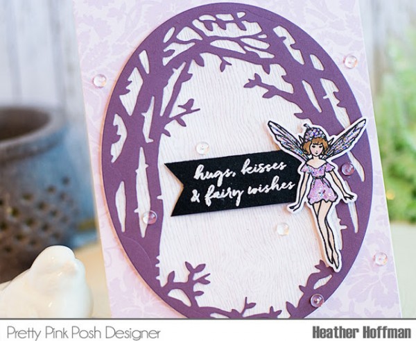
The sentiment was heat embossed on black cardstock, and the clear droplets glue on just perfectly with a drop of Glossy Accents.
![]() Prizes: Hero Arts is giving away one kit as a prize to one blog reader – selected from the comments across all of the blogs in the hop. Be sure to hop along and leave comments on all the stops!
Prizes: Hero Arts is giving away one kit as a prize to one blog reader – selected from the comments across all of the blogs in the hop. Be sure to hop along and leave comments on all the stops!
We hope you enjoyed this post and seeing our popular Clear Droplets in this fun Hero Arts kit. Thanks so much for stopping by today!
LOVing the Glow of your GREEN magical meadow!!
Your first card looks like a summer sunrise, love it!
Your cards are sooo lovely! I love love love the green and yellow together! :)
Both your cards are gorgeous…these fairies are delightful.
So beautiful, love what you have done with the kit. Thanks for the inspiration!!
Awesome cards and kit!
The purple card is so pretty. I love the combination of the different textures/patters.
Your cards are just stunning. Hero Arts has amazing kits!
The yellow and green card looks like the sun is coming up in the forest, love it!
LOVELOVELOVELOVELOVE this!!! The clear droplets look spectacular inside the shaker and your colors are stunning!!! TFS!
Wow. Each card along the hop is better than the next. This is a sure sign that creativity is high with this kit!
Beautiful cards! I love the droplets in the shaker card. Thank you for sharing!
This card is so original! I love it!!
I love all the sparkle in your cards! I love the brightness of the green on your first card! These are beautiful!
What gorgeous cards. Love the shaker card the coloring is simply gorgeous. Always loved shaker cards. The purple card is just simple and elegant. Thank you for sharing.
This is really pretty & bright & beautiful. Love the oval frame with the little birdie.
Stunning cards.
Lovely cards.
So awesome that you are included in the kit. Your fairy cards turned out so pretty! Thank you for sharing!!
What pretty cards. Really liked the colors on the first one.
I just adore your beautiful cards. I’m just in love with the beautiful Fairy kit! Beautiful colors and ideas.
What a darling stamp kit . . . love it!
Just love both cards, but that shaker with droplets looks amazing!!
So lovely I like the way your shaker card just seems to glow …
Darling cards. I love the sweet kit… those fairies are such so precious. Love the bright colors and all the sparkle and shine.
Gorgeous cards! Especially love the green one with the mushrooms!
Great cards!
So pretty, I love the colors, :or really think that die is so perfect with the fairies!
Gorgeous card! Love those drops.
Wonderful cards, but I really love the first one !!!
I really like the second card. The background paper is beautiful, so many ways to use just about everything. Thanks for sharing.
Both of your cards are absolutely beautiful!!
Your cards are beautiful! I absolutely love this kit. I think it may be my favorite so far. That “frame” die is stunning and the sentiments and fairies are gorgeous. Thank you for sharing!
Lovely cards, really
like the shaker one.
Great kit.
Carla from Utah
Very magical. I like the different colors.
Love the bright colors you used for your card. It makes those sequins stand out even more. Thanks for sharing.
Using the droplets in the shaker is beautiful. Both cards were amazing!
I really like both of your cards but I especially like the colors you chose to use on the first one. They are so vibrant!!!
Awww!!!! Awesome cards!!! I love the colours you chose for these fantastic cards!!! Really stunning!!!
The green card reminds me of Fern Gully!
Wow so pretty , love your background.
so so pretty!
Beautiful cards!!Love your color choices!!
I love love love the purple card. Beautiful!
Your cards are both so sweet.
Your cards are lovely. The subtle mushrooms juxtaposes the brightness of the rest of the card so nicely.
Wonderful job!
Your cards are so pretty and cheerful. Love your ideas with the wonderful kit.
Your cards are fantastic.. Love the green frame on the bright yellow background. Thank you for sharing and being part of the giveaway
Love both of your fairy cards!
Gorgeous cards! Love the sweet fairy stamps and that awesome frame die… magical!
Like the use of the unusual fairy colors in first card but really love the purple card.
Beautiful card love the shaker with the clear drops. SO pretty!
I love the yellow and green the best. This kit is going to be fun.
Your two cards are really beautiful, but I always had a preference for the shaker cards.
So so pretty Love thes color application.
both of these are great, but I have to say my favorite is the green and yellow card. My favorite color is green and my twin sister’s is yellow!
Nice bright versions here. Love the droplets. I like this set.
Love your creativity and this release.
This card looks like Spring. Very pretty.
What lovely cards. The drops are the perfect finishing touch.
Beautiful cards. I love shaker cards, thanks for sharing.
Wow – Love your cards. The more I see of this Hero arts kit the more I like it.
The droplets are neat! Thanks for sharing.
Gorgeous cards!
Lovely cards! Terrific, bright colour Scheme!
Beautiful Shaker card!
I am loving’ this kit. The sentiments that go with the fairy are sweet.
Lovely cards made with the August Monthly Kit! Great color choices! TFS
Your card is awesome. The little clear droplets are the perfect finishing touch. I must have some of those. Thanks for sharing your creativity. Love this set. Have a magical day.
Wow both so beautiful!!
I love the little clear droplets. They really make the card, but the fairy is the star of the show. Great set. Have a magical day.
I love the green colors on the die-cut. Your card reminds me of dew drops falling in a tropical paradise. So very pretty.
I love the green colors on the die-cut. Your card reminds me of dew drops falling in a tropical paradise.
Love the bold colors and the clear pops. Pretty!
enchanting cards. . .
What beautiful work you do! And I of course LOVE the clear droplets and how you used them! Thanks so much for sharing with us your unique use of these products and for participating in this great hop and giveaway.
Heather I love how you took them in two completely different color directions. I love that you used the droplets for the shaker, they give a whole different look then sequins. Thanks for sharing and inspiring.
Your cards are gorgeous. This kit is beautiful. Thanks for sharing.
Hello Paulina, Both your cards came out outstanding! The fairies are so precious. I’m really loving the Hero Art kit there are so many fabulous creations that can be made.
Love this set and the cards you made with it.
love your cards and color choices beautiful, this kit is fun
Both cards are so pretty, love the sentiment on the purple card!
Love your color choice! Magical! And I’m in love with all your sequins and these droplets are not excluded :-)) Thank you!
I am so in love with this kit – and those fairies ….. so delightful.
Love your card ideas, am so excited to get the kit and start creating!
I really like the green and yellow card. The subtle mushrooms are a nice touch.
Lovely cards! I especially love the shaker card!
Your green card is stunning
Love your cards!
This is a fabulous kit.
Bright and fun!
Such a stunning card love the green
Love this kit, beautiful card.
Stunning card love the green
Love the clear droplets. The Dreams are Made sentiment set and stencil are on my wish list.
What striking cards and colours. Lovely.
Really pretty cards!
Two different but equally stunning cards. The shaker card with the droplets made be believe that the fairy was going to transform into a mermaid, and the purple card was an elegant example of this unique Hero Arts kit.
Lovely cards! I especially like the subtle use of mushrooms along the bottom of the green and yellow card. Thanks for sharing!
OMGosh these are so fabulous, I love them
Beautiful cards. Love the clear droplets, just the right touch,
Love this kit! Great cards!
Two gorgeous cards!
Thank you for sharing!
Such lovely cards! So beautiful and both so different.
Such happy colors!
My girls would so love to play with this kit as we craft for homeschooling! Gorgeous card and kit, just no money to buy ;o(
Thanks for the chance to win!
~God bless~
Both cards are lovely! However, your second card REALLY catches my eye and heart!
Your cards are so pretty Heather, I especially like the shaker and the clear droplets are beautiful in it!
Love your beautiful card!
Lovely cards.
Both of these are gorgeous! This is such a great kit! Loving the inspiration – thank you!
All the cards I have seen are just so pretty. Love them all.
Beautiful & magical!
Those clear droplets are AWESOME in this kit!! Love your cards!
lovely set of cards!!
Oh these are so fabulous, love the green and yellow combination
These are so pretty! I especially love Heather’s first card, it is striking and so unique in those awesome colors! And love the mushrooms stamped in pigment, very cool. So glad there are Droplets in the kit, and that you joined the hop! Yay! :)
Such pretty cards. The sequins are a nice touch.
Love the “Forrest” feel of the green card! Thank you!
Love the purple theme.
My granddaughter loves your purple fairy card! It’s her favorite color!
Lovely cards!
Wow, just WOW! I love each of these cards!
Your use of colors are amazing. They are so bright and lovely. The shaker card design is a favirite because of the use of Pretty Pink Posh droplets.
Love your color choices because they are so bright and lovely. The use of Pretty Pink Posh droplets are great, they add to the illusion of bubble under the water. Perfect shaker card.
Love your shaker card design and the clear droplet you used. Great use of colors.
OOOO I love your cards. Your color schemes are great!
Great cards. I really like how the mushrooms are barely there on the first one. TFS!!
Amazing card! love the green frame with the yellow background!
This is lovely! Love the color combination – the greens and yellows look like a summer day!
Love your green and yellow fairy card. Looks awesome
Both of these cards are just lovely. I especially like those droplets used inside your shaker card!
Love your green and yellow card–so pretty!
Just beautiful Heather!
Two beautiful cards. My fave is the bright green one. I love the yellow inside the frame and also the patterns of mushrooms and stars on the green frame. Very subtle!
Both cards are so much fun. Really like the clear droplets.
Wow, the green and yellow is wonderful. Love it.
Love the colors, so pretty!
The green and yellow are inspired – loved the look of them together!!
Amazing cards – the colors just pop! Thank you so much!
That die cut is fantastic.
It makes such a wonderful frame for the fairies.
Love the colors.
thanks for sharing a fantastic card.
Love your cards.
Oh, I love your very August scene! Peridot and all that! Thank you very much!
Love how bright the first card is! Those droplets are divine!!
These cards are wonderful!! Love them and this new card kit:)
Both of your cards are beautiful, I love the clear drops in the first card, they look magical!
They are so beautiful, Paulina. Love the colors!
I love this kit. Your card is beautiful
I like how clever you constructed these projects, they looks so pretty!
This kit is truly magical. Love seeing all the different magic everyone is creating. Thanks for sharing and for a chance to win.
lovely cards–the greens in the first card are so very bright–August on a piece of paper!
I really can feel the nature with the first one! The second is cute and girly! Love it! Hero Arts kit is a mixed of elegance and magical vibe! I love it and it is perfect for my card making projects. I’ve been sending letters to different part of the world and my letters will look so beautiful with the use of these stamps! The Shakespearean Poetry Stamp is one of the stamps that I liked the most because of poetry and words on it but I also like the Fairy Stamp and Dreams Are Made Stamp because they are very detailed! I really want this kit and I can’t wait to use them and share them with my friends!
Heather you always create masterpieces, these are amazing.
The first card is my favorite of your two. Really love the greens and yellow ink mixtures and of course those little specks of white ink. Great cards! Can’t wait to use these and try out your color combos. Thanks for sharing ;)
Pretty cards. The droplets look great. Thanks.
Awesome cards. I like how the green and yellow go well together.
You used yellow, my favorite color, on your first card. It’s so pretty and then you used green and a green that goes perfectly with the yellow. You are so good with colors. The purple card is also pretty but as you can probably tell, I love the yellow card better. Thanks for showing us your beautiful cards and for giving us a chance to win the set. I hope I win! LOL
love, love and love the blended greens on this card, absolutely a fav.
How could anyone not want to go to that glowing fairy kingdom!
Two lovely examples of what can be done with these awesome set. I really wish I had it too.
These cards are beautiful with the colors you used and I love how you used the droplets on the first card.
I love all of the cards you made for this hop. The fairy in the jar is so unique. My favorite are the little cards for your daughters lunchbox. She will just love those.
Beautiful cards!!
OH my gosh I have GOT to get some of those clear droplets! Such beautiful cards, tfs!
Bit cards are beautiful! Really love the bright green and yellow on your first!
How could we not like this beautiful card kit, with all the beautiful fairy flying around and sprinkling fairy dust wherever they go. Both of your cards are beautiful, the first one really pops for me. TFS
What pretty cards! The colors are captivating! Thanks for sharing!
I just knew I was going to see sequins on your cards (love your sequins!), what a surprise to see a shaker card with the water droplets! It’s fantastic!
Both cards are lovely! I just love this kit!
OMG! Another great cads! I love the yellow background color for the fairy
Fabulous projects. Love the green/yellow combo. TFS
I love, what you did with the green and yellow. I love the splatter technique along the edges of the card. I just love green and this feels like she should be a wood nymph rather than a fairy, but very magical either way!
Perfect idea for a shaker card!
Love the yellow and green background that you created, makes it look super magically.
One so bold and both with favorite colors of mine. Love the layers and the versatility of these pieces. TFS! This is one great kit!
Very cute! I like color combos, the sparkly sequins, the woodsy feel. So sweet.
I love the idea of using droplets in a shaker card! So pretty!
The green and yellow background is really nice and I love the woodsy feel of the card – stunning!
Very pretty cards especially the first one with the droplets!
I like that you showed the versatility of the die.
Love the papers and clear stickles.
Love the bright green panel. Very happy shade of green.
Beautiful card using the green and yellow!! Thanks for sharing your creativity!
I love both your cards! The green shaker card is especially beautiful!
Love the droplets in the shaker!
The first card is striking, my fav is the purple (my fav color!) wonderful job!
Love these cards, great to use in building a scene, love those fairies and the die cut
The front of your green card looks so pretty with the images you stamped in white over the distress ink. I’ll have to try this. The clear droplets look good on this card and add to the magic. The purple card is sweet. When you said it is a one layer card I at first thought you meant it didn’t have a back. This reminded me of a child’s valentine and I thought this design on a single piece of cardstock would make a great valentine! I’m interested in seeing the translucent woodgrain paper. I like it in the oval.
Two lovely cards, I love the shaker design for this stamp/die kit!
I love how you sponged the backgroud frame die cut, and the farie is great!
Hi Paulina, Loved, loved your green and yellow shaker card. Those colors are unusual and fab!!! Also loved your 2nd card as well. Thanks for sharing.
Dianne K.
Fantastic cards. I especially love the bright and beautiful background on the first card.
The bright vibrant colors in the shaker card are truly amazing! I cant wait to recreate one for myself!
Love the droplets inside the shaker! So clever!
Both cards are great, but the yellow and green one really stands out.
Oooh, I like how you used the clear droplets for the shaker bits! Also, the subtle stamped images are nice on your colorful card! The woodgrain background works great for your second card!